We’ve got the (not so) Blues!
#TuesdayTrend
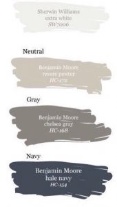
The (Not So) Blues
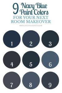
There must have been a TON of people who read our Paint Analysis Blog because Blues are EVERYWHERE! Designers and homeowners are painting a decorating with blue hues from all over the color spectrum. From light blue walls to dark blue cabinets, blue is the “it” color of early 2018.
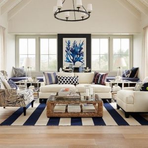
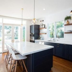
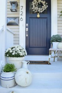
Some people are choosing to hide blues in subtle ways, like woven into a rug or in a picture on the wall. Others are going all in, painting their kitchen cabinets deep navy or adding a navy accent wall. Gold is a beautiful contrast to darker blue hues, so we’re also starting to see more and more gold kitchen and bath hardware. It would not surprise me if this ends up being a trend in the not too distant future. Have you noticed an increase in the number or navy front doors you’ve been seeing? I sure have! I remember when red front doors where in… not anymore! Out with the old, in the with the blue. ?
There have been hundreds of studies done on colors and the effects they have on us physiologically. It’s pretty widely accepted that blue is a calming and serene color, so it’s not hard to see why so many people are drawn to it and want it in their homes. Researchers have even gone as far to say that viewing the color blue can actually lower your heart rate and body temperature – crazy!
Blue is perfect for contrasting against neutral colors like gray or beige. This is a great way to mix things up and add a bold element to your space without creating a mood that is overwhelming or busy. It is also a very versatile color, being easily added to a modern, classic, or even (trendy) farmhouse décor and is great for combining with the natural wood trend.
I’m trying to figure out how to integrate it into my space. What do you think – Will you give it a shot?